I gave the Epperson Gallery two paintings this morning: “Trash Day“, my personal favorite and “First Avenue“. I needed one more painting to meet my quota, so went for a drive in the hills to balance my two town paintings with a country.
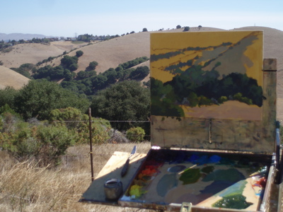
Here’s my setup. I started with a 12×16 linen canvas toned with Yellow Ochre.

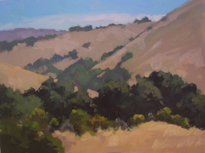
And the finished painting:
Carquinez Hills – Oil on Linen – 12×16″

This one is dynamite Ed. I especially like seeing it in its natural habitat, on the easel. Seems you’ve really captured the heat of the day, as well as a lot of space on such a small canvas. Great, great, great!
All the best
Cooper
Wow, thanks Cooper! I’m looking forward to seeing the show tonight…there are 30-40 artists in it. Some of the work I saw last night looked great. Cheers.
I agree with Cooper, it’s great to see the work in progress on location. I’ve admired your work for quite some time now.
BTW, thank you for visiting my blog. You’ll have to go back, because I went on and on about the town of Harmony, in response to your comment! : D
Ed, it was great talking to you today at Epperson. I enjoyed seeing your paintings, especially trash day, you are right, the reds are much better on the actual painting. Congratulations on your award….come visit my newbie blog if you get a chance…robinpurcellpaints.blogspot.com
Great seeing you last night, Robin. I checked out your blog, looks great. I encourage other readers of my blog to check out your work, which is wonderfully distinctive. Your painting “Crimson Diablo” from your post July 19th is a great example. You’re somehow able to have lots of fun with color and form, and yet communicate things like ariel perspective (representing distance). So often, when artists push elements like color/form, basics like communicating distance goes out the door. Not you! Bravo!
Ed.. very nice work on this one. I like the patterning of the trees across fields. They way you have subdued the chroma in the BG hills and elements adds a huge amount of depth.
This is beautiful. I love the gentle transition from foreground to background. Your brushwork is lovely.
Thanks Kelly and Michael. That subtle chroma change is important, as you know. Basically, it’s neutralizing the color (adding red to green) and using more blue and white. The values of distant objects must come closer together.