If you’re a painter and have been exposed to many other working artists (in workshops, plein air events, etc) you’ll notice some commonalities in how we paint, and certainly lots of individual differences. One significant difference I’ve noticed to the practice of toning your canvas. Most plein air artists agree that a start white canvas working outdoors (even in the shade) is very hard on the eyes. It also detracts–I think–from one my goals, which is freedom. I want to be loose! Have fun! I don’t want to see bits of stark white showing up here and there. It’s a distraction.
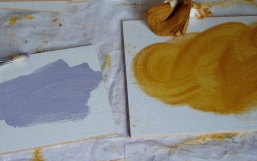
Artists have solved this problem by toning their canvas, either at their painting site or in the studio. For the uninitiated: toning is the practice of deadening the white of a canvas with a color, usually in a light to mid-value range. Toning on site has it’s advantages: you can select the undertone to match the scene more closely. However, the disadvantage I see is that I believe it usually results in slightly more grayish, muddy colors. And I love color.
 What color to tone? This is a rather difficult question, there are so many exceptions, and by the way, some artists only tone one color all the time. I vary my tone. Ted Georschner tones with a Yellow Ocher; Ken Auster tones with a medium value gray. Both undeniably master artists, so there is no right or wrong answer. Its what you’re comfortable with.
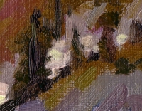
I tone an equal number of linen canvas boards with Yellow Ocher and with Gray. I’ve studied with both Ted and Ken, and I’ve seen the value in both–depending upon the circumstances. Basically, I use a Grey tone on paintings where the light is Grey-ish (eg, night scenes, cloudy days, etc). I use a Yellow Ocher tone when I want a strong feeling of sun light. The details of two different paintings below demonstrate each approach. The gray I use is a Golden Acrylic Gesso, and I mix the gray myself using a combination of Paynes Gray and Cadmium Red (both acrylic, of course). The Yellow Ocher is Classic Artist Oils, right out of the tube.
 |
 |
| This is a detail from a snow scene in which I used a gray toned board. It was quite cloudy, and there was a lot of gray in the picture. Made life easier. |
This is also a snow scene detail, but there was bright sunlight strong. The bits of Yellow showing through the canvas add a sense of light. |
So, what’s right for you? You’ll never know, until you experiment. Happy Painting!
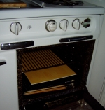
 PS. A toned canvas must be dry thoroughly before you apply paint, because it can easily wipe off. I dry my toned canvases (and even finished paintings) in my oven. Don’t laugh! I have about a dozen pilot lights in this old Wedgwood stove, may as well use that energy for some purpose. I leave them in for a day or two (no more, otherwise the boards can warp).
William Wray —
My wife wuld never let me to that, I use the big fan if I’m in a hurry, but usually I stick them in my water heater closet.
My Paintings:
http://williamwray.com/
http://williamwray.blogspot.com/
Ed…so how do you make the yellow ocre tone…..is it an oil/turp mix?
Deb
Deb, I don’t actually mix turp with the Yellow Ocre paint, although you could do that. I rub the paint in. I find this ‘breaks” the pigment less, meaning it really keeps is tone. Takes a little longer to dry, but as you can see (my oven!) this is not an issue.
When I’m in the field, I sometimes use a combination of tones, based on the painting’s design. In that case, because I want it to dry quickly, I use a medium of 40% linseed oil, 30% Damar Varnish and 30% Full Gum Turpentine. See my subsequent posts on Ovanes Berberian’s technique/demo.
Hello, i love edterpening.com! Let me in, please 🙂
Hi Ed —
I came to this entry after wondering what was the “Wedgewood oven” you mentioned in your latest blog entry. OK, now I understand. Laugh on me, it really is an oven. I’ve never done that, but it sounds like a workable solution. I’d worry though about the paint subtly leeching out onto the interior surfaces of a food oven during the process of it’s evaporation/drying.
I’m only saying this because I think of all the myriad forms of exposure to heavy metals we get over a lifetime of painting. I make some effort to avoid unnecessary contact including wearing gloves (nitrile –because I get a rash with latex) and carrying bottled water for drinking instead of the currently fashionable re-usable container of tap water.
I sometimes tone my panels on site with a ruddy color that I think is called Terra Rosa or Red Earth, which is essentially just an iron oxide. It’s very stable.
If I apply it as an oil paint it remains somewhat mixable and serves to blend into the underpainting slightly toning it. The small nicks that don’t get touched in the painting process show through as red touches like you demonstrate above with your ochre toning.
If I apply it as an acrylic paint, it dries almost immediately and can be painted over without mixing into the rest. As with oil toning, the color shows through somewhat. The small nicks of color that aren’t covered over create a sparkle of color that enlivens the color space of the painting.
http://www.johnd.com