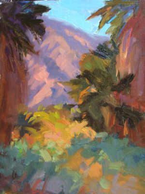
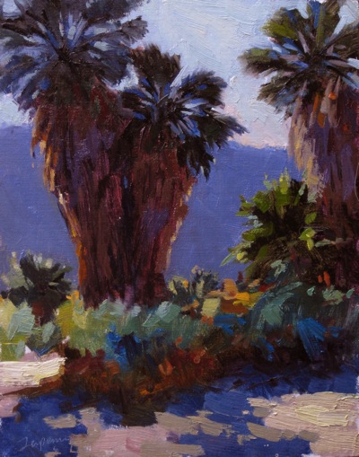
Palm trees have beautiful strength, character and movement. They can make a great subject. While in 1,000 Palms a few weeks ago, I painted two field studies (one, two) of a view between groups of palms to the steep hills below. The two studies where done in different light conditions, the first with the hill in shadow, and the second, a smaller opening than the first, which showed the hill later in the day as it was touched by the late afternoon sun.
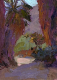
This one, my third, shows the light conditions with the light behind the palms, but looking in the same general direction. I used the reference photo in my studio, together with some of the color notes from the first two studies. Since I was in the studio, I remembered to take snap shots at various stages of development, and so have a little video made of snap shots tied together with iMovie. This has been posted on my YouTube channel (and added to a playlist I created of other painting demos).
click to view the video on YouTube
I can see this series holding interest, and think I’m ready to use these studies and paint much larger studio works. Stay tuned for those, I have this Friday off, so maybe I’ll dedicate the day to this task.
Here’s the final painting:
Through the Palms #3, Oil on Linen, 14×11
Here are the first two paintings using this basic design (click any to enlarge). What do you think? Any favorites or feedback?
 Through the Palms #2 Oil on Linen, 12×9 |
.


Hey Ed. I think #3 is fantasticly the best. You have the contrast pop’en, where as in #1 it’s too low, and #2 has perfect distant mountains but i also spend time looking at the light bushed in the center.
Thanks, Mark, good feedback on these three.
I like 3 the best for sure. It has the best design. I like the back lit palm a lot and the way you have a simple flat hill contrasting the rich brushwork up front.
“Keep values accrate as a foundation”, Like that quote from the video demo.
1 is interesting too, but the palm top on the left seems squeezed in. I like the way you draw the viewer through the scene.
2, I am not sure where to look. Good color, but my least favorite of the three.
Ed,
They are all excellent Plein Air paintings. I agree with all the other bloggers that number 3 is the best of the series. Number 1 & 2 compositions may not translate well into large paintings. The palms on the left and right seem to wall off the paintings and become heavy to me, but I like them as small paintings.
Being from the suburbs of Chicago, I don’t know palm trees very well. But in your number 3 painting, if I were going to make a large painting of it, I would add a “slight amount” of that yellow warm light in-between the large mass of the key palms,to make it clear their are two trees. I would also add some highlights peaking between some of the palms. I tried it in Photoshop and it lighten up the mass of the key two palms and added more of that great back light that you captured.
Ed, thanks again for the site and the opportunity to share our thoughts.
Tom
Hi Ed,
I’m inline with the other contributors in choosing #3 for pretty much the same considerations. the contrast (use of more extreme values) and palette make the painting look more natural even though i never visited this place and your painting it in the studio.
#3 appeals more even for the tactile qualities of the palm tree bark and leafy parts – possibly aided by the use of more extreme values that help create depth and texture in the tree trunk and the palms themselves. But i feel you also invested more time rendering these in this painting than in the other two…could this be because you were painting in the more comfortable and stable studio environment?
For this same reason, i think that #3 possibly lends itself better to a bigger painting eventually and am just looking forward to see the outcome 🙂
From a composition perspective, i prefer #1 of the three as i find it leads the eye better into the central scene area onto the tree overlapping the right-hand side rock.I share the feeling that #2 seems to miss a focal point that can attract the eye and a path(s) across which to reach it.
Keep up the good work and the energy!
Chris (Malta)
Liking these palm studies! I agree that the back lighted one is the best. I also agree with Tom about separating the two palms with some of that warm, yellow back light and also a little more highlights peeking through the palms. Could Christian be right about #3 being better in that it was painted within your studio environment? I always seem to have to finish my outdoor work in my studio and with the help of reference photography. Wish I didn’t have to do that so much.