Ten fellow artists gave me their opinions of yesterdays paintings, thank you! Great feedback. Here’s today’s efforts. Went back to Trout Lake in the morning, then spent the afternoon at the first stop on the Telluride gondola.
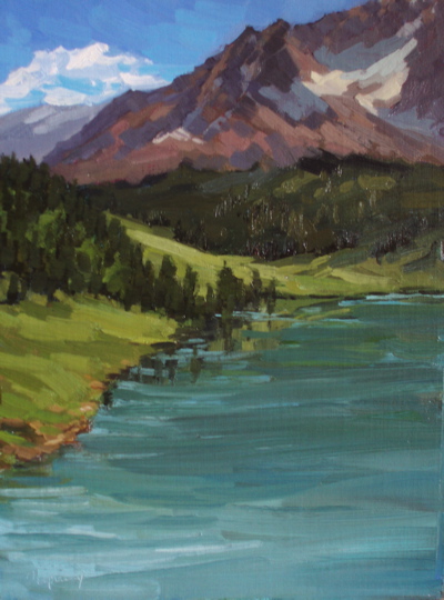
I struggled with the reflection on this, repainting it at least 3 times. The wind kept chnaging, so one moment reflect sky would show (with wind), the next a perfect reflection. This version is in between.
Trout Lake #2, Oil on Linen, 16×12 (AVAILABLE)
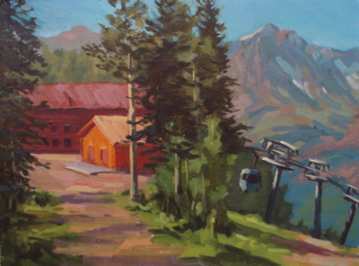
A gondola connects Telluride with Mountain Village, another town. This is the first stop, which is basically the top of the peak between the two towns. Not much here, other than hiking trails and a restaurant.
As you can see, this is an unusual composition. This is how it looked. It almost looks like two paintings, with the trees in the middle separating them. What are your thoughts on this one? Do the two halves need to be better integrated?
Telluride Gondola, Oil on Linen, 16×12 (SOLD)
Thanks again everyone for giving me crtiques this week. I need to turn in my final paintings for the show in a couple of days.


I had a feeling the first painting’s light green grass cover was too light, and when I looked at the photo in black and white, it didn’t read well. Hmmm….to change or not? It does move the eye through the painting. Thoughts?
Ed, I love the gondola painting. As a person who is afraid of heights, it gives me the exact feeling. A protected area up to the building and then the drop off to nothing… arghhh. I think it is just perfect the way it is. 🙂
I like the color of the grass in the other, but the gondola went to the top of my list.
Jo
Hi, Ed! Nice work! I’m glad you’re having a blast in Telluride. (Nice little town, but Ouray’s quieter. 😉 ) On the second painting, I would suggest only that you provide a “stop” for that gondola. Perhaps another tree, which you could link to that middle group with some dark grasses.
I think the grass in that first one is fine. Not too light, not too dark, just the right amount of warmth.
I don’t have problems with he grass being too light, it is nice how it reflects the bright sky. It gives the painting a clear fresh look. But if that refection is so strong, how about the reflection on the water, shouldn’t that be even stronger?
Maybe at the bottom of the painting some of the tension is lost. As if the area is somewhat too big.
I don’t have a problem either with the division into two of the second painting. I know it is often considered “wrong” but I don’t always think it is. The buildings are rather strong in presence (colour) in my view though. Great idea to try to convey the depth of the valley. I like the complicated composition.
Going great Ed! Looking forward to tomorrow’s post.
This painting is great, like it, simple composition nice rythm, fresh painted,
great color harmony. Think the green works fine and I like the fresh reflections in the water further up. The comment on the water shape area being too big I agree with, how important is this lower part of the water?.
The other thing that strikes me a bit is the sharp edges on the green further away – it makes it come maybe closer than it is.
And then the other one yes it is like two parts, but for me there is only one picture around the red house. It is like the tall trees in the middle draw my attention away from the house to the low right corner and into this interesting mountain view but then stops me from entering back to picture.
Hi Ed……
I LOVE THE GONDOLA! I, too am afraid of heights. The drop off (short but sweer) on the right is very realistic. Love the reds and the hint of same color in the right side mountains. If you are still concerned about two distinct sides you could add just a bit of stronger bluish tone in the upper left mountain range but I think it’s great already.
In painting # one the lake down in front could maybe have used some vertical strokes to add movement/cut monotany. I know it’s big but I kinda get stuck there. The mountain, trees and grassland are great.
After leaving Rigby Satuarday, I drove up to Jackson Hole….went as far as Moose to see the magnificent Tetons. I DO GET the same feeling looking at your mountain peaks and the lakes….
Wish I were there…P.K.
I feel there are two seperate paintings going on in “trout lake #2.” The top half of the painting feels complete. Great use of colors and brush stokes to capture the light and colors of the mountains. The dark blue sky fading into light on the horizon really adds depth to the sky and conveys intrest in the forest below. However, the lower half of the painting feels incomplete in the overall painting. you need to bring some of the strong colors of the mountain in the lake. that should make it pleasing to the eye. thanks for sharing your work…your inspiring me to get back out there….for that thank you very much.
I like both of these paintings but I have to go with the gondola painting for originality and complex composition…very truthful feel to the height and atmosphere. Maybe just a touch of brighter red on the roof of left building will anchor the gondolas on the lower right? The mountain painting has gorgeous color…maybe a little of the reddish mountain color in the lake to break it up a bit? I love the way the water swells towards the viewer…I’m there!!!
The backdrop of the first painting is superb. The mountain is beautifully done. I also think the water are is too large and would need some dynamic shapes in it to echo the shapes of the background.
The second one is perfect.
For the first piece, I’m going to crop it into a 12×12, if it doesn’t sell. If you block out the bottom of the painting and make it a square composition, it works much better.