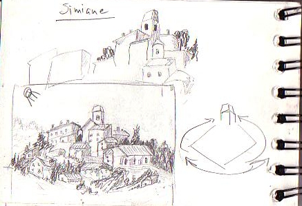
This is another example of a sketch I did in France to plan out a painting.  I use shapes and values to lead the viewers eye around.  This composition is based on a circular plan.  I actually never ended up painting this, but it’s a good example of the type of planning that can really help you create a successful painting.
Simiane De Rotunda

Uncategorized

Leave a Reply

Your email address will not be published. Required fields are marked *

You may use these HTML tags and attributes:

<a href="" title=""> <abbr title=""> <acronym title=""> <b> <blockquote cite=""> <cite> <code> <del datetime=""> <em> <i> <q cite=""> <s> <strike> <strong>

This site uses Akismet to reduce spam. Learn how your comment data is processed.