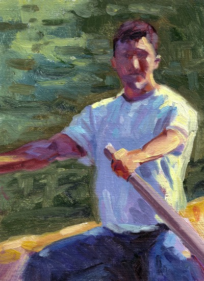
While looking through reference photos last night, I stopped at one that had caught my eye before. In the distance, a rower in a small row boat on the lake. After zooming and cropping, I found an image and design that I liked. I’m starting to second-guess parts of this painting, now that I’ve had a day away from it and see it here online. Although the water on the left had reflected sky and light through the trees, I’m not sure it does the painting any good. There’s not an area for the eye to rest. I may try blocking it back out, or making the color/value shifts too dramatic. Also, that blue in the water is too close to the blues elsewhere in the painting, especially the t-shirt. If I’d kept to greens there, it would probably have given the figure additional emphasis.
I can see reading other blogs we do a lot of second-guessing. Not sure I’ll get back to this one, if I do, I’ll post an update. In the meantime, your thoughts are welcome!


Yes I think you’re right about the blue. It might look a bit flat without the reflections, but maybe just at the top.
I hope you don’t mind me saying that the left arm looks a bit thin compared with the right.
You’re right about the left arm, Keith. Actually, it will be easy to fix, as I’m going to remove the light shadows around the right arm..I’ll just thin that one out a bit.
thanks for the feedback!
I think it’s stunning and reminds me of some of Homer’s watercolors of rowers. I love the contrast in color temperature, shadow and light. My eye rests right on his face, travels down his arm to the oar, and back up the light on his shirt, with a visit here and there to other spots, but always back to his face. Brilliant!
I like your blog theme. I’m guessing this is done on self-hosted WordPress, not on WP.com?
Jana