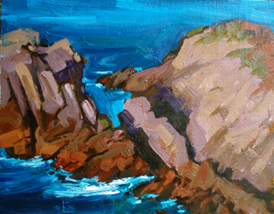
This is another painting part of my seascape “rocks & surf” series. I’m trying to keep it simple, bold and fresh. There’s a line I don’t want to cross between a fresh work and one that’s over-worked. I hate crossing that line!
I think I may define the sandstone on the right a bit more, and although this is a fairly close-crop view, I should also think about how to show a bit more distance.
“The Wedge” (Point Lobos) – Oil on Linen – 11×14

I am sorry to intrude (since we are not acquainted), this is a beautiful painting, but I think you can add the sense of distance fairly easily by making the blue at the top just a bit less saturated.
I like the boldness of your recent work.
I see you have been painting a lot of rocky scenes. Check out the work of Albert Handell…even though his work is in another medium(pastel), I like the way he paints rocks a lot– for a recent seascape I did, consulting his work helped me see what I could do to improve my own cliffs and rocks. .Just a thought.
Thanks,Lena, for your suggestion. I agree.
Thanks,Rhonda. Good suggestion. I also like Albert Handell’s work. Wonderful.
I agree with Lena about laying back the ocean. You might also want to grey it out and lighten the blue as it goes back. On the right hand rocks you might darken them as they go towards the edge to help bring the eye back to the center areas of the painting.
Love this one, Ed. I wouldn’t do too much with the rock mass on the right; I like the lack of craggy detail. More detail would make it fight with the mass to the left.
Hey Ed
Something with the light on the sea , could it be taken down in value maybe the rocks would come out better.
Hi Ed,
I think you could show distance also by having the rock color on the right porgress gradually from warm to cool.
PS I want to start a blog and not sure how to start. Do I need a website first?
Thanks,
Nancy Darling
ps2 This website and blog are awesome!
Nancy – You don’t need a website to have a blog. You can start one for free on Google’s Blogger.com website. I like to have my own Internet domain (EdTerpening.com) because it gives me more flexibility and control, but I’m an old software engineer, so I’m technical enough to manage it. If you’re just getting started, Blogger.com may work well for you.
Send me your Blogger URL if you get started!
Hi Ed
Stumbled accross your blog and have to say I love the paintings – great economical brushwork going on! This is something I’m striving for and have a lot to learn! Some interesting articles on Facebook too which I recently started on.
Anyway this is a great site for me so if you don’t mind I’ve added a link from my blog?
Regards
Ryan
Thanks, Ryan! Your skies are great, I visited your blog today. Thanks again for the link. Cheers.
Terrific Ed. Great light and movement. Great composition. Palette. A knockout!