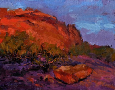
Now that I’m back from Scottsdale, I’ve been looking through my reference photos. After class one day, I was at Papago Park around sunset. The setting sun striking the red rocks made quite an impression, as well as the beautiful violet shadows created. This is from reference, but also from memory, thinking about that striking impression. The color in this is of course pushed pretty far, but I had fun with it!
Papago Park, Arizona

Wow, Ed! I love it! You say the colors are pushed “pretty far”, and I can see where this is not necessarily in your comfort zone, palette wise; but in my opinion you should keep pushing in this direction. Powerful stuff.
Thanks, Bill! I had fun.
Sleep interrupted, I just read your article in the latest American Artist Workshop Magazine, and really enjoyed it! I’m excited to follow your blog. Thanks!
Wow, wow! I love it when you go dead simple in comp. This is HOT in more ways than one.
nice piece this one Ed
if I may offer a reason why this one works better to my eye than others : there’s a hierarchy of brush-strokes. Particuarly like the lift-off twist & flick in the light blue streak in the sky. Somecheeky little marks in the half-tones as well.
Paint on!