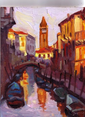
Hung out at home today, so went through my digital library to find images to paint. I’ve always loved this late afternoon shot of Venice, in the “Golden Hour”. This is a small study, but I may work on a studio version as well. The light really was this orange, and hitting the red brick buildings, made it just sing “fire”. Don’t know if it’s too much. I wonder too if the shadows striking the buildings on the right is reading well. They’re cast shadows from the buildings on the left.
It was fun adding pure bits of color here and there to represent people in the background, and on the boats. Man-made colors against the calm of nature makes for nice variation.


ed
cant find your email address anywhere. i want to ask you about the underpainting method of using grayed washes in the right values and then bringing up the color. can you email me? thanks man
mike
Ed,
Very nice painting. Buildings are so difficult to paint in an artistic manor. Often artist get caught up in the details of the architecture. Your interpretation is great!
The award winner on the cover of International Artist Magazine, in this months issue is not where I would want to aspire to as a painter. Even though the artist did a marvelous job of capturing the detail of the scene. I’d rather aspire to your direction, again nice job!
I paint plein air and paint indoors with references that “I” photograph also. I also use Photoshop to help resolve painting issues along the way on larger works.
It appears that more and more artist are working this way, but the purist seem to be critical of both photos and the computer as tools. This is a topic worth discussing if other readers are interested? The new computer monitors and digital information are so much more informative than the Walmart Prints of yesteryear… it’s almost like being outside 🙂
TomC
Hi Mike,
The technique I learned from Mark K. is based on the teachings of John F. Carlson. My experience is consistent with yours: I’ve used both Camille’s and Mark’s technique, and Mark’s is much more natural, easier to learn I think. The results are different. I think you get a much more subtle work with his technique.
Anyway, back to Carlson. Have you read his book? It’s a must for landscape painters. He taught that there are 4 tonal planes in the landscape, and your value scheme must consistently reflect that. The planes, lightest to darkest, are: Sky; Ground; Slanted Planes (eg hills) and Upright (eg, trees).
Select an average value and neutral local color for each plane, and wash it in. I know painters tend to wash the darkest shadow color, but this is not what I recall about Mark’s technique. He washed in an average value, then added darks/lights/mid-tones over. I tend to use lots of turps in this phase to get it to dry faster, although I think you can be successful with a scumbling technique with no turps.
As I recall, Mark would tend to block in planes the same color, even if they’d be separated later (eg, a stand of mixed trees would get one wash color). Once you have the canvas covered with all the planes, you can start to refine each plane, add darker and lighter notes within the average value, make shifts in temperature, etc. Of course, your paint must generally be thicker at this point, and your touch on the canvas must reflect its current state, eg, if you used the technique with lots of turpentine, you need to let it dry a bit, or if you used a standard medium (Oil/Turpentine/Varnish), you need to wait until it’s somewhat “tacky”. If you scumbled in with no turps (something I remember Camille doing), you can paint the next layer right away.
I think the neutral color washes provide a nice foundation or stage for more intense color later. They also allow you to visualize the final painting sooner, and to ensure your basic values are correct and hold together.
I’ll email Mark and ask if he’d like to jump in with his corrections and thoughts.
I’ve been using averaging for quite some time now and don’t see a down side to it. In fact, it becomes apparent, one’s need for a good drawing, and a keen eye for refining the shapes of the lights and darks. If you don’t have good drawing and tone, you may as well forget color. Putting color on bad drawing is like putting lipstick on a pig.
Carefully, draw the scene with pencil, reinforce the graphite again with a water-based ink- esta muy importante. Use a watercolor brush and put the line down nice and black or you will lose the drawing when you brush in the tonal averages.
Lately, I’ve been using acrylic to draw and block in. After years of painting with oil I need to cut back on petroleums and let my body heal up for a bit. The acrylic dries immediately. No fumes.
You won’t like painting on the acrylic surface with oil paint unless you first lightly grease the surface with linseed oil. I hope that helps. !Chao!
love the color contrast in this one. can’t wait to see the studio version!
Mark, thanks so much for chiming in to clarify your technique!
Thanks, too, Holly for your enthusiasm for this work. I think I’ll do some larger studio paintings once I finish more studies.