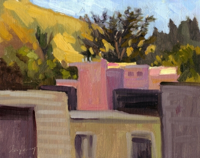
This is the second study of views from the area around Buena Vista Park. This is actually from the “Scent Garden” of the Park Hill condos across the street from the park, looking South-East. The distant hill is Corona Heights.
In this painting, I concentrated on contrasting the natural elements in the top third with the man-made structures below. I’m having fun, figuring out how to play with these geometric shapes to make interesting patterns. I’m not sure the values in the foreground are quite right (probably too light, as they’re in shadow), but I think there’s an interesting juxtaposition of shapes and colors.

Right or not right, it is interesting to see what happens when the foreground is darkened and the contrast diminished (as I did in a photo-editor). It’s a different painting perhaps, but it makes the pink house and the background light pop up in a very nice way.
Bart, I’d love to see what you did with this image in a photo editor. learning Photoshop is on my to-do list. Seems a great way to play with a painting after the fact and learn.
Nice piece, Ed! An alternative to Photoshop is simply a sheet of clear plastic placed over the painting. You can then daub on paint over already-painted areas to try different colors, values, etc., and then wipe it all off and try other combinations — all leaving your original piece untouched!
Hey Ed . . .it seems I can’t complete a day without checking on you. I love that you are putting it all out there. These pieces hold great promise!! Keep up the great work!
Mike
love the shapes taking your eye back into the painting. Beautiful greens.