One of the ongoing challenges I am working on is a balance between colorism (pushing local color) and tonalism (photographic accurate value and color). A technique I have been using to mix very accurate color I call “brush in front”, which relies on accurate color spot mixing promoted by Charles Hawthorne and Henry Henche (see the text “Hawthorne on Painting”). This method differs from how I (and most artists) usually judge color, which is strictly be relative relationships of one color to another. This is just another approach, either can work equally well.
Here’s how it works
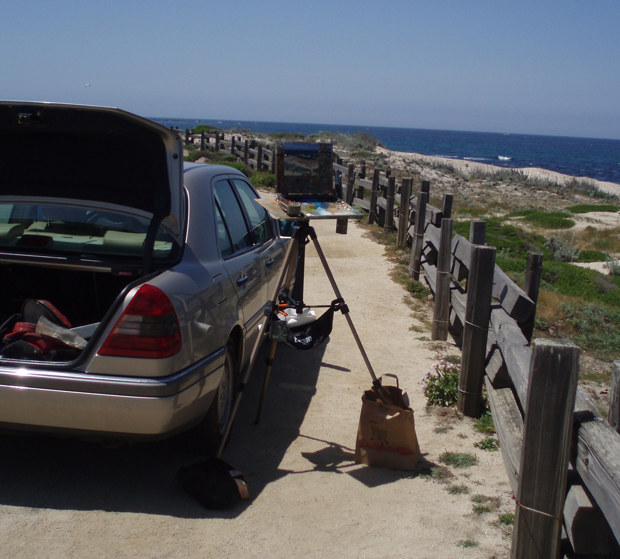 1. POSITION YOURSELF: Find a scene to paint that will allow you to set up your easel so that the light is behind you, and never directly in front of you. Set your easel up so the your canvas is in the shade. This usually means you’ll have to angle your easel at a 45-90-degree angle from the scene your painting.
2. BRACKET YOUR VALUE SCALE. In general, the range of pigment values from black to white isn’t sufficient to represent nature’s light range, which causes us to make some compromises in a painting by working within the practical range of pigment. In general, I find this technique best suited to subjects where the value range fits–but how do you know?
I test for a match by comparing the lightest light in the scene against white paint and the darkest dark in a scene against black paint. Dip the back end of your brush with white, then black, and compare, making sure that you compare the sun-lit side of the pigment on the brush (not the shadow side) to the scene. Place the brush in your line of sight between you and the part of the scene you’re comparing. For example, for the seascape below, I dipped the back end of my brush in white and placed it in my line of sight between me and the foreground white-water waves, which represented the lightest color in the scene. Normally, white is light enough for a landscape scene and black is not dark enough, but close. Realizing that the darkest darks in an outdoor daylight scene represent a very small space on the canvas, I don’t worry about it, but instead make adjustments for the values around the darks to compensate.
 3. TEST COLOR SPOTS. With your canvas and easel in the right spot, and having tested the range of your pigments with the scene in front of you, you’re now ready to mix paint! I still work from dark-to-light. In the screen shot to your right (click to enlarge), I mixed the color of the rocks just below the white wave. I keep mixing until the color on the brush (remember, the lit side of the brush, not the shadow) matches the color spot in the scene. Usually, this involves starting with a larger pile of base color that comes close, and then adjusting–typically with complementary colors to gray the base color, or warms or cools to adjust the color temperature.
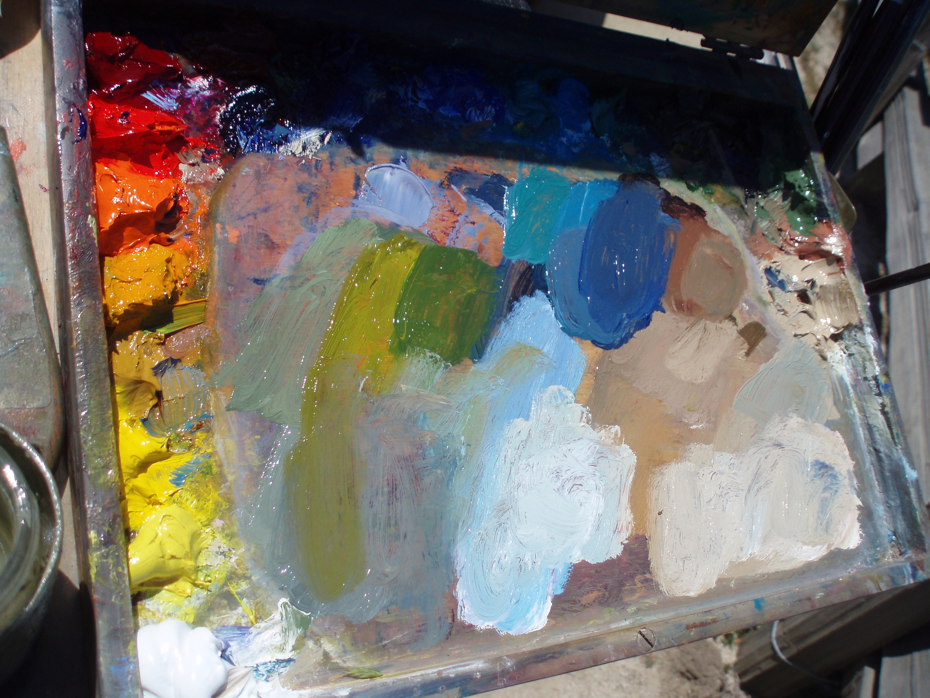
Even on this small pochade easel palette, I will attempt to keep base colors intact, and branch out color strings from there. A “color string” is a base color modified warm, cool, or complementary, but of the same value–this last point is important. If you want to get vibration in your painting, place these slight variations of color adjacent to each other, but keep the value the same. Only do this in areas where you want the eye to go, the center of interest, etc.
Samples
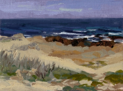
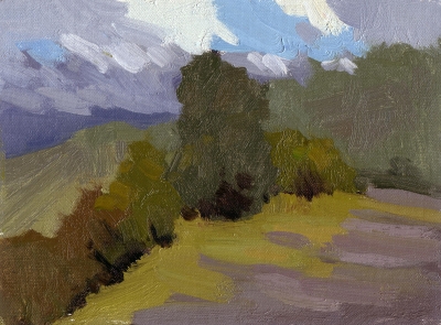
Here are two paintings done recently using this technique. The first is the seascape I did when taking the screen shots above, the second from the recent Gold Country Plein Air show. I tried to limit the number of color spots to focus on, in this case, just 6: the sky, ocean water, wet rocks, dry rocks, sand and foliage. To add some interest (eg, foreground rocks), I used color strings of warm, cool and complementary colors. One thing that surprised me in this painting was how dark the sky ended up, but in the end, I think it reads well (click to enlarge). It also surprised me (somewhat) how important grays are, and how many of them there are in a scene. Save the color for where it counts.
In this sample, the color variations in the foreground foliage were very, very slight. I think there are some nice color harmonies going on here.
Hillside Color Study – Oil on Linen – 6×8″
Both paintings are available–since they are studies–for $100 each (Pacific Grove is SOLD). Email me if you’re interested. If you try this technique, send me URLs to your images and I’ll update this page, enter comments with your own experiences and observations.
The idea of keeping values the same or close to achieve maximum color vibration is no little insignificant idea. Though difficult for many painters to grasp, this principle is huge! Great suggestiongs!
Great idea, and thanks for taking the time to explain it so well.
It does makes you think.
btw. I’ve put your pochade on my desktop, …. great sight!
hi Ed,
I tryed to post a long comment before but it just didnt work??
What I do to mix colors:
I mix two piles of color on the palett to compare the two colors.
I think its also important, to have bright,bold colors in the forground and more pale ones in the background this assures that one still got the room-feeling (specialy on landscapes)
On the other side you see more color if u just focus on one spot. That happend to me when i was focusing on some distant trees on a hill chain. The closer u look the more you get the “real” color of that tree-green like it would stand right in front of you once you “subtract” the atmoshere from it.
But if u squint on that hill, you get the color in the context of it all.
Maybe with comparing colors its the same then with the closer u look the more u loose the feeling from it all. That is, the more you “shrink” your view on one color, the brighter and bolder it gets.
For me its like I like both methods I like to look close and work on detail as well as step back and get the “big” picture…
Thanks for the explanation Ed.
It must be a good way to avoid “painting what you think you see”.
Nice to hear it can surprise like with the sky. Both the sketches have something unexpected.
I especially like the hillside study, the colours indeed have something special. It would be a great start for a painting.
Thanks, Bart, I agree. i like the color harmony too. I think too often I over-saturate my color. This exercise teaches me the importance of grays.
Hey Ed!
Nice to see you are working hard.
The one thing I would add is…look for other ways to mix grays. Mixing complementary colors together will absolutely create grays but you will risk getting very muddy in the end. That has been my experience.
Elio
hey Elio,
Thanks for stopping by. Good suggestion regarding grays.
I tried the color matching on the brush to the subject. I have a question now–I was painting with my easel shaded by a white umbrella. Should I hold the brush under the umbrella when I’m matching the color?? There’s an amazing difference, but I figure the paint should be judged in the same context as the canvas?
Thanks for the great blog.
Judy Warner
Good question, Judy. You do NOT need to have your canvas in the same light/shade as your brush. Typically, you DO need to compare the color on the brush in full sun, not the shadow side of the brush, or the brus in complete shadow. If your brush is in shadow, you will not be able to mix colors light enough to represent your scene. This means that if you are painting under an embrella, you’ll need to hold your brush in the sunlight to accurately judge the color.
ok, will try again today. I think the value range in full sun may be wider than my paint value range!! But my paintings usually don’t have enough value contrast to make me happy, so it should be good for me to push it. Judy
Thanks for your suggestions — particularly about placement of the easel in relation to the sun and paying particular attention to using the sunlit side of the brush for matching color. I find that matching color — especially distant masses to be very frustrating. Since so many colors tend to blue or blue/gray in some form or other as they extend toward the horizon, it can be difficult to even identify what color I’m looking at even though it is right there in front of me.
On the topic of mixing grays, I understand what Elio is talking about when he mentions grays getting the colors very muddy. I was wondering if you’ve ever used Paynes Gray as a base and adjusting it this way or that with other colors? Although I’ve never done so, I think I might give it a try sometime.
I should mention that this technique is great for finding the right character of the color (hue, temperature), but shouldn’t always be used to judge value, particularly when–in a landscape painting–you want to “push” out the distance by making bluer and ligher than you may actually see. Sometimes you need to design a landscape with specific layers of atmosphere (eg, 2-5), each within a general value range.
I think Elio and I have different color techniques (each valid, and I like his work a lot). I believe you need some grays in order for the more intense colors to really sing. I guess a “mud” is only a that, if it is meant to be a more saturated color, and not a supporting gray. It’s often very surprising how a color mixed on the palette looks “muddy”, but when placed in the context of a painting, really works. Color is relative, and grays vs. muds are relative to the situation.