I’m often asked about my palette, so thought I’d dedicate a post to this for future reference. First, I know many painters (great ones, in fact) believe in a limited palette. Most that follow that path do so because it ensures color harmony, and it certainly makes packing paints much easier. I’d love to carry three colors plus white, as artist’s like Ken Auster and Kevin Macpherson do. I go back-and-forth on this, but I think an extended, “full spectrum” color palette–the same used by Ovanes Berberian and other colorists, including his mentor Serge Bongart–is best for my needs. I would suggest however that if you’re new to oil painting, start with a limitted palette and branch out from there, once you’ve become familiar with their mixing properties first. Start with Alizarin Crimson, Cadnium Yellow Medium and Ultramarine Blue.
When I use my full color spectrum palette, I don’t cram every color into every painting. That would be difficult to harmonize (unless you add a bit of black to ever cover pile, which does harmonize a painting nicely). I include a wide array of colors because I want a full range of options for any single painting. I will typically paint with a limitted set of colors and ignore the rest for a given work. It may be that a scene is best represented with Sap Green, Alizarin and White. You never know. I look at a scene carefully and pick out major color notes that match to my palette, before I begin.
My palette consists of the following paints, all Classic Artist Oils unless otherwise noted. I buy my paints in either 10oz caulking tubes or quart containers. Much cheaper than the tiny tubes sold in art supply stores.?
 |
Hansa Yellow. This is my cool yellow. I’ve tried Cadnium Yellow Light, but I find it doesn’t have as much punch as this yellow. It’s transparent enought to mix well with any color on your palette. I’ll use it for my lightest light in just about any situation (see samples below). |  |
Cadium Yellow Medium. This is a common warm, light value yellow. |
 |
Yellow Ocrhe. Good medium value cool yellow. As a basic earthtone, a must of course for any landscape painter. I’ll use this color, white and sometimes a tad Cadmium Orange for the light side of clouds. |  |
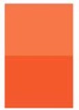
Hansa Yellow Orange. This is my favorite color. It’s a cool orange. It makes great greens, mixed with either California Blue or Ultramarine Blue. It also mixes really well with Permanet Rose to make great sunset colors. |
 |
Cadmium Orange. Your basic warm orange. Too opaque for my tastes. I’d love it if every color on my palette were transparent–they’re so much easier to mix. I guess I should be a watercolorist. This will probably be the first color I drop from my palette, although I like it there because I can mix it with any of my blues to make a really nice gray. |  |
Fire Red. This is my warm mid-value red. Most artists use Cad Red Light, but I find the tinting strength of this color much better. It’s very powerful. Good to use in flesh tone mixtures (I found this color while studying the figure with Jim Smyth). |
 |
Permanent Rose (Winsor Newton) or Rose Madder (Classic Artist Oils). This Winsor Newton color is dangerously strong. Use with care to create great medium value violets with Cobalt Blue. It’s also great for painting flowers. |  |
Alizarin Crimson. My dark, cool red. I alternate between Classic Artist’s Oils and Gamblin brands. The latter claims to make a permanent pigment. I like to mix it with Sap Green to make my darkest darks. Makes for a nice transparent washes, and you can easily mix warm/cool varieties. |
| California Blue. This is a very dark version of Ultramarine Blue. I got the recipe from Brigitte Curt, who I believe got it from Ovanes Berberian. It’s a custom mixture of Phthalo Blue and . Great for making cool transparent darks, and dark greens together with Hanse Yellow Orange. |
 |
Ultramarine Blue. The standard dark, warm-valued blue. Has lots of practical uses, but I find that it really tends to kill the life of warmer-toned mixtures. If I’m trying to cool a color, I’m more likely to reach for Cerulean Blue or California Blue. | |
 |
Cobalt Blue. This is considered a “true blue” (ie, neither cool nor warm). It’s the most expensive color on my palette, so I only use it carefully–generally in sky colors and to make beuatiful medium value violets with Permanent Rose. |  |
Cerulean Blue. This is usually the truest sky color, particularly along the coast–whereas I find Cobalt Blue more true at higher elevations or places with little humidity. |
 |
Magnesium Blue. This warm blue is by far the most powerful on my palette, second to Permanent Rose. It’s tinting strength is incredible. Use with caution! I rare mix this with anything, other than white of course. If you want to add instant intensity to your sky, add a little of this blue, the same value as a Cobolt Blue and white sky. They vibrate well together. |  |
Virdian Green. My cool green. I tend to only use this in seascapes and citiscapes. It’s just not a terrible “naturual” looking color by itself, except for representing man-made things, like stop lights that read “go” 🙂 |
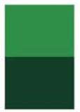 |
Sap Green. I rarely use this color, other than mixing dark transparent underwashes. I will grab a bit to “green up” a color quickly, because as a transparent color, it does mix well and rarely muddies other mixtures. |
 |
Mars Black. This is an opaque black, so I don’t use it to mix transparent underwashes. I do use it to tone down colors that are too raw. Of course you can do that by mixing the colors complement, but if you’re plein air painting and racing to capture something, grabbing a little black works more quickly. |
 |
Titanium White. I’ve tried others, like Flake White, but find this white meets my needs just fine. |
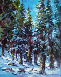 Here are some examples of how I use my palette. Thanksgiving Day Snow on the right shows my use of Magnesium Blue, vibrating against a Cobalt Blue sky. This painting also uses transparent washes quite a bit, which you can see in the top left (click the image to enlarge). The washes were made with Sap Green, Alizarin Crimson, and California Blue. I like the abstract quality of this painting, the caligraphic brush strokes. I was trying to convey both stillness and life.
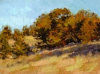 The “Peninsula Hillside” painting on the left shows how I use colors like Hansa Yellow Orange (in the trees), with a touch of blue to give it a golden green glow. I’ve also alternated Cerulean and Cobalt Blue in the sky to get that vibration. The trick is to do this without mixing the colors together and creating mud.
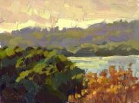 I typically mix my lightest lights with Hansa Yellow and Titanium White. The painting “Towards the Sun, Crystal Springs“, which I did facing the late afternoon sun, uses this combination. I also uses in my snow scenes to show the lightest lights of the snow.
Informative post, Ed. Thanks for sharing! Am going to check out a few of these colors.
Ed, would you mind enlarging upon the California Blue recipe, please? Thanks!
Thank you for this. I have never used Hansa Yellow. Makes me want to try it. I work with pastels mostly now, but this is very helpful information. Enjoyed going with you on your last excursions. 🙂
Jo
What a great post – a real treat to see your palette colours!
I’m reading Macpherson’s book right now and although the very limited palette sounds great (and obviously works beautifully) I’m far from that myself. But then I think that painting in acrylics it does make sense not to rely on mixing all your colours from just the three primaries. Especially not pre-mixing batches of colours… they would be dry before I even got to paint….
I really love “Towards the Sun, Crystal Springs“…
Hey Mike, sure, “California Blue” is a 50/50 mixture of Garbazole Violet and Phalo Blue. It makes a really beautiful dark blue. It would probably be considered “Ultramarine Blue Dark”, if there is such a color, although this color is generally a little more violet. Hope that helps, let me know if you need more information.
Regula, yes, the limited palette advice is probably not as appropriate for acrylic painters…Oil painters have a lot more flexibility (time!) to mix the right colors, both on their palette and on the painting itself, sometimes hours after the initial stroke.
One artist I would connect with is Gil Dellinger, find out what he does. I really like his work. Perhaps you could contact him through his gallery: http://www.waterhousegallery.com/Dellinger.html
Ed – thank you so much for the link to Dellinger’s work. I’m just looking at his paintings… wow!
Another great post – I particularly like the tweak of the useful mixes. Consider yourself blogged for my weekly round-up post on Sunday.
hey. just wanted to say i really enjoy your paintings. i scanned google images for some good skies and while your’s struck me they weren’t what i had had in mind. but then i got caught up just looking at all the art i came across and while there were so many with many great qualities, the only ones that seemed like a good complete painting were your paintings (other than the ones dated 1600-1900 or so). heh.
i want to expound on what i mean by complete paintings, but first want to say that i’m just an extremely beginner painter but have been devouring books on painting and paintings. so i don’t know much about what i’m saying, just what i feel. the overriding theme to the other ones i looked at was exquisite detail in one aspect of their painting – a smothering contrast of blue and black clouds for example. but then their water looked fake and stupid. or their colors were good for the most part but they’d have a bright red somewhere that didn’t fit in at all. many of your paintings on the other hand have a pure, full quality about them. while others may have more technical skill, i feel like you’re the better painter.
i just really wanted to say this for some reason.
anyway, also, i saw the one way back where you had a very blue lake in front of a mountain and you thought you’d maybe tone down the blue. which, and i’m not not noticing the -would it be irony?- of that lake’s possible too bright blueness, that, and i’m wondering what you ended up doing with it, because at first i thought people were right that it was too blue, but then i ended up agreeing with the one that said to just brighten the foliage around it since it gave distance to the mountain. so since eventually i liked the original more than the faded-down one, my words above can still hold true.
oh yeah. that’s where plein air’s from. impressionists are my favorite right now.
Thanks, Katherine! I also just posted the next in my series of top 10 painting observations (#6). Enjoy!
Hi Ed,
More great info! I’m inspired by your work and web site regularly. Thanks!
Here are a couple of questions:
I’ve been using a very limited palette for a long time and I’m going to start adding some more colors again. How do you carry all of those paints? I know you buy the large sizes of the Classic paints. Do you re-package them somehow? I can’t see trying to carry those quart cans unless you have a llama or pack mule!
I’ve been buying the 4 oz. tubes because they’re easier to haul around. I really need to start getting the bigger sizes but don’t know the best way to re-package them without them drying out or stuffing tubes! (what a mess!) Anyway, any helpful hints would be appreciated.
Thanx….
Hi Randy – good question. You are correct, although I do paint outdoors with my full plein air palette, i don’t take the 10 oz tubes. Way to heavy! I did used to buy empty tubes and fill them with paint to go, but that takes more time than it’s worth, so now I buy/pack the 4oz tubes, plus I am still trying to use up odds and ends of tubes I have.
This works well for me. Not too heavy at all.
Hey Ed,
Thanks! I was worried that I was going to have to join a gym!
btw – the more I poke around your site and blog, the more gems I find. I maintain several sites and I know how much work this represents. Thanks for providing this to all us painting crazies!
Ed,
I am just starting with oil paints…have been painting with watercolors in past…and am wondering about finding garbazole violet. I’ve not been able to find the color anywhere nor a substitute. Do you have any suggestions? Thanks so much for the information on your site.
Michele
Michelle: I tried emailing you, but it didn’t work, hopefully, you’ll read this.
Garbazole Violet is made by Classic Artist Oils, you can buy from them online. If you want a substiute…let’s see, its basically a very dark value warm (redish) violet. So, a deep Magenta could work.
Ed,
I have been using students oil paints for a few months and now I am planning to buy artist’s grade colours. I prefer a limited palette for the time being. I have a few questions about what all to buy right now.
1.I am trying to learn underpainting techniqe and I’ve heard that this is best done with raw umber. Should I include this colour in my list or should I just use black?
2.What is the advantage of using colours like Crimson Lake or Ultramarine Blue in a limited pallette as you have said, rather that using pure red (like cad red) or pure blue?
3.Curently I use oil paper for painting. What’s the advantage of using canvas boards?
4.Curently I use only linseed oil as solvent. Do I have to buy a thinner?
5. Which brown should I buy? Or do I need one?
To answer Aravind’s questions above:
1.I am trying to learn underpainting techniqe and I’ve heard that this is best done with raw umber. Should I include this colour in my list or should I just use black?
— I definitely wouldn’t recommend black for under-painting, as it will almost certainly dull colors you lay on top of it. I select the underpainting color based on the subject. For underpaintings that I’d like particularly warm, I mix Alizarin Crimson & Sap Green. These are complementary colors, so the more Green you mix, the duller the warm color. For paintings for which I’d like a cooler under-painting, I mix Ultramarine Deep (my “California Blue”) and Alizarin Crimson.
2.What is the advantage of using colours like Crimson Lake or Ultramarine Blue in a limited pallette as you have said, rather that using pure red (like cad red) or pure blue?
— Cad Reds are too opaque for my tastes. I prefer Alizarin Crimson because it’s more transparent, and therefore more flexible in mixing.
3.Curently I use oil paper for painting. What’s the advantage of using canvas boards?
— I have limited experience with canvas paper, but in general, it doesn’t soak up the paint, like a oil-primed canvas board does. If you’re going to paint an underpainting first using transparent colors, you need a surface that has some absorption.
4.Curently I use only linseed oil as solvent. Do I have to buy a thinner?
— Do you mean medium? It’s fine to use linseed oil to re-oil paint that may have dried out on your palette, but using it alone as a medium isn’t useful unless mixed with a dryer. I mix 1/8 linseed oil, and the remaining 7/8 split between 100% full gum turpentine and damar varnish.
5. Which brown should I buy? Or do I need one?
The only earthtone I have on my palette is Yellow Ocrhe. Like I said, you can mix some wonder umbers using Alizarin Crimson and Sap Green. I prefer to mix them this way.
Hope this helps!
This information is just about the most useful info I have seen on the internet for the plein air painter.
In the last several months I have begun using the Artist Oil Colors. It makes using all other paints seem like you are painting with cold cream cheese. I LOVE the softened butter consistency.
Quick Question….
What is the blue you use most often (tube or mixed color) as a shadow color?
I love your tips!
Thank you for posting this wonderful information!
Great POST Ed.
Thanks, Martha, for your comment. Regarding the color I mix fir shadow color: it depends on many factors, including: local color of the object, light quality (intensity, color) and the color design of the painting, eg, high key/low key, complementary color vs analogous color vs triadic, etc.
So, I guess the short answer is I don’t use the same color for every shadow, but rather mix the right color based on the factors above.
Hi Ed, Was there a misprint in the American Atist article sidebox on your palette colors? It says you use “Vasari” Classic Artists’ Oils. I’ve just realized that there is “Vasari Classic Artists’ Oil Colors” and “Classic Artist Oils” & since you are on the later’s web site I think the magazine made a mistake…? Thank you, Leecia
Leecia: yes, the American Artist article April, 2009) contains a misprint. I don’t use Vasarri paint, but rather Classic Artists Oils from Triangle Coatings. The URLs for that manufacturer are in my post.