“Things should be made as simple as possible, but not simpler.” – Albert Einstein
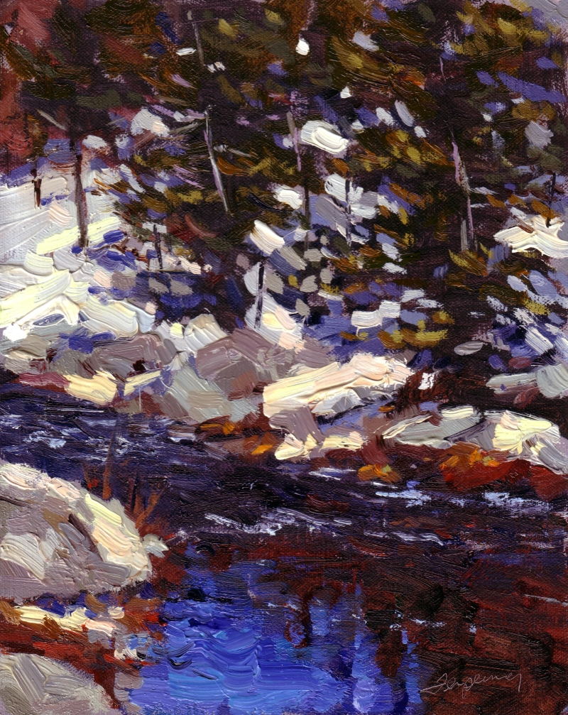
Great paintings have a great underlying abstract design, typically based on 3-7 large abstract shapes of value. If you’re a representational artist, don’t fool yourself: perfectly painted detail only matters if it sits within a broader design of interesting abstract shapes. Those few big abstract shapes will make or break a painting. No amount of detail can save a poorly designed painting.
As painters, we’re at a big disadvantage in our rapidly evolving culture of shorter attention spans and immediate gratification. How much time do you give a novel before you decide to finish it? Hours, probably days. The average viewer of a painting evaluates it in seconds, and then may linger for minutes if they like it (watch people in a museum 🙂
The eye first registers the big abstract shapes, delineated typically by value differences or sometimes hues of the same value. In any case, that first impression is of shapes, not subject matter. Abstraction is hugely important to get the viewer’s eye, but you’ll keep the viewer based on the painting-within-a-painting. Think of the abstract design as the first layer and the detail, color, subject–everything else-as the ‘icing on the cake” that the viewer will enjoy once you’ve got their attention.
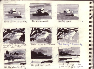
When I paint, I start with a notan sketch that identifies the 3-7 big shapes of value and keep each shape together by staying within the value family of the shape. I then have fun within each shape with color, texture and warm/cool, saturated/gray color. Here are sample notans where I’ve taken the same scene I tried different designs:
Here are some tips for designing a painting in effective abstractions.
- Design a value scheme with at least one dominant value, and others subordinate in unequal proportions.
- Divide your picture into at least 3 and no more than 7 shapes. Here’s a quick and easy exercise you can do anywhere: with a sketchpad, look at a scene, and decide where those 3-7 big shapes are, and draw them as interlocking shapes. You’ll almost certainly have to make compromises to abstract the scene, such as merging values together, but this is a necessary part of design (see notans above).
- Limit your values. Some of the strongest designs are just 3 values. it’s really difficult to keep to a solid, limited value structure, but well worth it.
- Here’s a tip to simplify your values: If–like me–you’re near-sighted and wear corrective lenses: slide your glasses down to look at the scene (blurring it) and view your work surface with your glasses as you look down. If you don’t wear glasses, blur your view by squinting (note this is less effective as squinting also darkens your view). I almost always paint most of my painting without my glasses on as I love focusing on accurate color and value first. It works!


Great observation! I’ve been reminded of the abstract element many times through the years. Somehow it slips into the dark recesses and I revert to details and over saturated color. Thanks for reminding me once again .
I will faithfully follow up on your observations. Great painting, Ed!
Best wishes, Dean
Very good post and something I too overlook from time to time. You just had me looking over my shoulder. squinting, to see if my preliminary drawings of a piece worked.
Thanks Nicole
My friend Katherine gave me a heads up to this post. Well said, wonderfully illustrated – great post.
Nicole did a nice job on her site of showing how a design can be shown with a simple value notan sketch on this post. Looks great. http://www.nicolecaulfield.com/wordpress/?p=139
Excellent paintings and blog Ed. As we all know, all art is abstract.
Love,
Linda
notes on tone – a painter’s ‘ditty’ whilst painting ..
one tone
two tone
three tone
four tone
half tone
quarter tone
notan
no tone
not quite a notan I know…
http://adamcope.blogspot.com/2007/06/la-maison-peyarade-bergerac.html
I do the same thing with my glasses also…. much easier to see the main shapes of a scene when your bad eyesight takes away any details you may be distracted by! A tip I learnt from my school art teacher, who was also short-sighted.
I listened to many people and squinted to get my values correct. But, I found it much better to simply take my glasses off to get the block in shapes and values correct. I actually found that when squinting with my glasses off it cleared the picture back up, just like looking through a small hole does!
Love this post, Ed, great explanation and thanks for sharing your thumbnail sketch experiments on this.
One thing I struggle with is understanding (once I get the value study right) how to apply color that is still “OK” for that value… my teacher Brigitte Curt had me use a little blue plastic to look through, which works to a degree but doesn’t it skew the values by its own blue tone? Or am I over analyzing this?
Yes, that blue plastic trick (or red, for that matter), doesn’t really show you the values. One technique Barry John Raybould uses a special kind of mirror, that he makes himself. I can’t recall exactly how the mirror is made (I’ll check my library of notes when I get home, I’m traveling right now).
If you have a small, hand-held digital camera with a large screen view-finder, another method is to photograph your scene and edit the picture in the camera to make it Greyscale. Most cameras support this, but then again, you must expose the picture correctly.
As to your question, “once you the know value, what color do you use?” It’s hard to give a general answer, but some ideas are : 1) keep your most instense/chromatic colors in the foreground and near the center of interest (gray-out from there); 2) keep your warmer colors in the foreground. Remember that colors drop out of your vision based on distance: Yellow first, then red, until blues remain in the distance.