Having worked in the tech and marketing industry for more than 20 years, I’ve attended more than 100 conferences–but I have to start by saying that this was the best ever. It’s even right up there with South by Southwest—a conference famous for the enthusiasm and camaraderie it generates. Attending this event was very much like going to a family reunion, meeting in person the many artists I’ve known only through the “blogosphere”. Many thanks to those readers that approached me and told me how my blog impacted their artful lives. I’m equally grateful for your contributions to me with your many helpful comments and support! It’s hard to believe this was PleinAir magazine’s first convention—they have a high bar for next year!
I didn’t take verbatim notes, but in most cases just jotted down some thoughts worth remembering. I hope this posts helps. The PleinAir Magazine team video taped everything, so I imagine they’ll publish a full account. My apologies to artists that didn’t get a lot of coverage here. My first priority was taking in the convention, and not “reporting”, so my notes are a bit uneven. If you attended, contribute what you heard in comments for this post, or provide links to your own posts to help complete the picture.
Portrait Demos: Alexey Steele, Tony Pro and Jeremy Lipking

This group of LA-based artists paint together often (and they’re active in social media), so there was clearly real comfort in their demo. Alexey uses brushes with really long handles (Rosemary’s brushes) that I found really interesting. I’m not painting the figure often in the studio much, but I can certainly see the benefit of standing back a few feet while painting. Who knows, this could be equally useful in plein air work? If you’ve tried Rosemary’s brushes, let me know. I purchased a few of the “Ivory” synthetics and have been testing them with the new Cobra water soluble oils. Unfortunately, they’re already starting to fray. As I’d like to make the transition to water soluble, let me know what synthetics you’ve been happy with.
Jeremy starts with blocks of color, not drawing. Like me, he seems to think in terms of shapes first, not line. I find that many of us are pushed to use line first, which is not equally effective for all painters. It’s like being left handed vs. right. You’re born that way!
Tony Pro uses Emerald Green, says Sargent used it. Haven’t tried it. Have you? Do you think it’s worth experimenting with?
Jeremy will mix up some light blues, since most blues from the tube are so dark. This makes sense, and is somewhat similar to Scott Christensen’s approach, although the latter mixes grays. I know Ray Roberts will also mix some mid-tone colors from pure as well. Worth trying. Tony uses the Brilliant Blue in figure work, which is interesting. I’ve tried it in plein air landscape work, and find it a good starting color for the sky. Radiant Magenta is used by two of the painters, which I believe is made by Gamblin. Two of the painters swear by Rosemary’s brushes.
Alexey (paraphrasing): “the world is made of paint, the visceral quality of paint is a strong part of the Russian school.” and., “art is an extreme sport“. Alexey’s great laugh filled the convention hall during the entire event! This man knows how to live life to its fullest.
Clyde Aspevig

Clyde’s lecture was one of the great highlights of the convention. Here is some of what resonated with me:
Think in terms of paint. Look at the real world and think of brushwork, how it comes to life in paint. This is very similar to Alexey’s view: “the world is made of paint”. Think of what you see as paint. That said, ideas (design) drive the success of a painting, not the application of paint.
Nature offers the unexpected. The beauty in the complexity, color, texture of a boulder is beautiful. We can learn from rocks! You can’t compete from nature, only learn from it. Eg, the pure yellow from the tube is gaudy compared to the reality of nature. Find abstractions in what you see that create visual interest. Find the unexpected. [Commentary] I don’t now about you, but I grow tired quickly of scenes and compositions that have been so overdone, they become trite. Why bother? Personally, I’ll paint the mundane or expected only when my goal is to learn something (eg, paint handling, color mixing, etc). A great way to learn to paint is to consciously control variables: eg, to learn values, paint in black and white; to learn color, take drawing out of the equation and paint colored blocks; to learn composition, paint abstractions of shapes.
Always grow. Be aware of the stagnant in your work and approach. Keep surprised and be surprising. Eg, paint a landscape without the sky to make the ground appear brighter—gives you more range of color and value. A trap in plein air is to not have the time to truly design the idea behind a painting. You arrive at a site, get enthused and start painting. Right? That’s why we need to combine plein air work (discovery, understanding light) with studio work, where you can focus on big ideas that you’ve learned from nature.
Empathy for what you paint is important. Understand the nature of things. Study a wave in every phase of it’s life. A rock deserves our understanding and attention. He recommended “The Natural History of the Senses” (by Diane Ackerman). Here’s an exercise: take any work of fiction, and paint a representation of it. What would the ideas and emotions in Catcher in the Rye look like? Not literally, but emotionally…ideas.
The value of restraint. Taste and restraint transcends the ordinary (we’ve all over-worked paintings, right!?). Taste is demonstrated by the restraint of one who knows what they want to say and how to say it, nothing more (Clint Eastwood’s Super Bowl commercial comes to my mind, where the class of Eastwood thrives in and event of no restraint, the Super Bowl). Restraint unleashes the beauty of mystery and ambiguity. Do we need to state it all? What fun is that for the viewer? Knowledge gaps engage, the viewer gets more as they view the painting over time. The sign of a good painting is one you’ll want to come back to again and again.
We’re nature’s advocate. As human beings, we cast a long shadow on nature. Don’t take it for granted. As artists, we can give voice to nature. Don’t let technology detract you from the quiet, powerful moments of life. John Muir: “I only went out for a walk, and finally concluded to stay out till sundown, for going out, I found, was really going in.”
Ken Auster Demonstration
“Demo’s are like a colonoscopy, the prep is worse than the event itself”, Ken Auster
Intellect & Emotion. There is an intellectual and emotional part to painting, and they should be kept separate. Use your intellect to solidify your idea and overall approach to convey it in paint. Intellect is part of the preparation process, NOT the painting process. 95% of bad paintings are people picking bad things to paint, they didn’t think about it. Use your foundation of skills built through experience and intellect, so you can let go and enjoy the emotional process of painting. Use your intellect to let go of what you see and interpret it in the way of paint. Painting outdoors teaches you to see things quickly, and builds your intellect of how nature and natural light behaves.
Painting is like an Oreo cookie. “I paint what I know, not what I see”. Everything (photos, painting en plein air) is reference for departure in the service of creating art, whether in the studio or in nature. Form, perspective, color and atmosphere may not exist in reference material, so you need to KNOW how to fill in the blanks. [Commentary] Have you ever invented the distance between mountains to expand aerial perspective, or to unify the value plan of a design? “Be influenced, but not held hostage by what you see.” Exercise: shrink wrap an object and paint it to understand its form. Painting is like an Oreo cookie, Intellect at the beginning and end, but passion in the middle, the meat of it.
Slobs let go! There are clean painters, and you know who they are! There are messy painters, but you wouldn’t know it from their work. He’s a secret slob. “If you want to be messy, it’s okay. Surprising things can happen when you let go like a slob!”
Cityscape tips. For cityscapes, he’ll paint one side with warm shadows, the other cool. Keeps it more and more abstract from the center of interest outward. This is the way your eye works. When you’re looking at a person on a moving streetcar, you’re not seeing how many windows are in the storefront across the street. Why paint it that way? Resolve the focal point early in the process, to have one lead actor supported by the remaining stage of canvas.
“I need a clean palette”. Pause. Looks around. Then he rips off a new sheet of white wax paper and places it OVER the old palette! Cool cat.
Matt Smith
There is no “plein air” style. It’s a method–especially to learn natural light–but not a style, and NOT a competition. You can make a painting more light filled not by painting bright/light highlights, but rather lightening your shadows. Give your shadows air. “Never paint from a photograph in front of your students. It’s like cussing in front of your kids. You know you do it, they know you do it, but you don’t want them to.”
Ned Mueller & Camille Przewodek
Scott Christensen
Being vulnerable is key to growth. Put yourself out there. Be prepared to fail. Embrace it, you’ll enjoy the process. You only have THIS time and memories. Really understand why you’re painting what your painting. To see color, look upside down. See it differently. The best paintings hold values, color, everything in reserve (this gets back to Clyde Aspevig’s comments on taste and restraint).
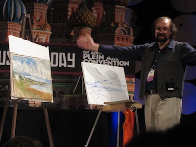
Russian Day
Russian Master Painter Nikolai Dubovik: “Plein air should be painted outdoors, not on stage” (laughter, applause…maybe next year there will be opportunities for more outdoor lectures and demos).
“The French invented paint in tubes. The English invented trains. Plein air was born :-)”
Sorry, just have a few notes from this demo. He drew the structure of the painting in Ultramarine Blue with a surprisingly small/narrow brush, using the side of the brush to scumble in masses. He uses a limited palette. “It’s possible to paint masterpieces in 6 shades of black. Every-time I pick up a brush, it’s like the first time. It’s a good feeling. What’s important is the process that gives you joy.“ His palette: Umber, Russian Yellow Ochre, Russian blacks (Ivory black), Ultramarine Blue. “I believe you should choose a scene your are capable or rendering, but always go beyond that (interpret, add).” The Russian tradition of plein air painting is quite diverse. Questions about mediums. He uses anything. The point is to get the paint on the canvas. There should be a point on the canvas that you feel you could throw a stone into it to show depth. You could reach into it. When you paint plein air, the air outdoors allows the paint to reach a kind of stickiness that he likes (that you can’t get inside). Also spoke about the importance of subtlety, and how that makes a painting believable.
Miscellaneous Snapshots

")
