I had a great day at Golden Gate Park yesterday, finishing two good studies.
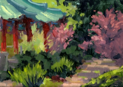
This view is the other side of the Golden Gate Pavilion peace pagoda, that I painted last week. There are some color harmonies here that I’m really happy with, and likely to use in a larger painting. In particular the left third of the painting, particularly the reds, distant greens and roof-top tile greens. The bushes in bright sun to the right in front of the red beams that worked well too. I wonder if the red tree to the right needs a little bright greens in there? I kept the bushes–just about everything, actually–very loose. I think I’ll go back to this spot tomorrow and try a larger canvas.
Golden Gate Pavilion – Oil on Linen – 9×12
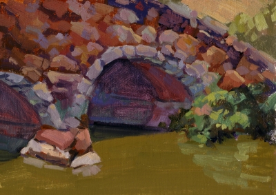
This is the bridge that leads to Strawberry Hill in the middle of Stow Lake. Built in the 1890’s, it survived the 1906 earthquake.
 It was my first painting, a warm up I guess for the one above. I also want to repaint this as I feel the rocks lost a little too much definition. I wanted to keep it abstract–yet representational, I’m always seeking that balance. In terms of color, I’m happy with the green water, and in fact that flat area of color is really needed to support the complexity of the bridge above, otherwise, I think the composition would have been too busy.
One particular challenge was the right underside of the bridge, where the tunnel doesn’t get direct sunlight, but reflected light from the water. I think this works well as painted, and in fact when I view the painting in grayscale it does read as expected. Nevertheless, I want to tackle this one again, perhaps this weekend.
Bridge to Strawberry Hill – Oil on Linen – 9×12
By the way, Gracie was with me all day. She had a blast following the tourists along the shore as they road the paddle boats around the lake, then chasing squirrels–her favorite pastime!


My favourite of the two, Ed, is “Bridge to Strawberry Hill.” I really like the quiet space the water provides near the bottom; it’s a great place for the eye to rest after examining the bridge. Also, warmth of the sunlit water is perfect!
Ed, I like your composition in this one. The piece has a very quiet feel too it, I guess because of the stillness of the water. The handling of the water in paritcular is great. Love the ochry colour there and the reflects are quite convincing.
cheers, Michael.
Ed, I like your composition in this one. The piece has a very quiet feel too it, I guess because of the stillness of the water. The handling of the water in paritcular is great. Love the ochry colour there and the reflects are quite convincing.
cheers, Michael.
Dear Ed:
I love your paintings, very rich in color! Nice brushwork too! I look forward to reading your blog periodically. There is some great info here. I was wondering if you ever took a workshop with Ken Auster? Also, do you know if he uses medium when using classic artist oils to move the paint more on the canvas?
Any input about his technique would be great. I like his type of work and yours as well.
Thanks,
Ruth Ann Greenberg
Hi Ruth, Thanks!
Yes, I have taken a workshop with Ken Auster, he’s great: a very smart teacher; good at explaining his technique–something many artists struggle with. I can recommend his workshops without hesitation.
Ken does not use any medium. He uses Classic artist oils, directly from the can. He uses a limited palette, if I recall correctly, it is Alizarin Crimson, Ultramarine Blue, and Cad Yellow Light. He also occasionally uses an “alien” color, to make his center of interest stand out. So, he may add something like Cerulean Blue to make the focal point stand out further, in addition to traditional techniques like having the darkest dark, lightest light, and strongest edges in the same focal point area.
One more thing about his technique I find interesting. He generally mixes the darks of objects first, then adds a white and a little yellow to represent the light side of the same object. Obviously this works well for his style of painting, which I think is more on the tonal side of the spectrum, as opposed to a colorist like Camille Przwodeck or Ovanes Berberian, who would tend to paint the light side with a completely different color combination. Both techniques have their merit, but I find Ken’s technique a bit more suited to plein air work, where you must work very quickly.
Hope this helps.
Ed,
Glad to have you back! Looking forward to seeing your latest.