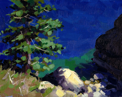
Painted this little study in my studio the other night from a reference photo. The view is from the Rubicon Trail looking down onto Lake Tahoe, which in this part of the lake is the deepest near shore. I painted in my usual “full key” (full value range), which allowed me to use rich colors and sharp value contrasts.

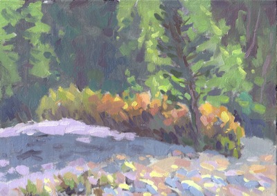
I set this painting next to my most recent “high key” value painting. It was striking to see the sharp contrast, and you can really see that the photo of the previous painting wasn’t over exposed, but really quite light. Coincidentally, both paintings had trees in them, and when side by side, the curve of the land connects, as if they’re part of the same scene.
So which painting gives the best feeling of light? Perhaps that’s an individual choice. I’m still very interested in this technique, so will continue to pursue it.

“High Key” Riverbed Study |
“Full Key” Tahoe Study |

These are both lovely but I think the full key study grabs my attention more and makes me feel like I’m there. I’ve been re-reading an old book I have about Milton Avery. Are you familiar with his work? He moved further and further away from value into the subtleties of color and simplifying his shapes. When I see his work in color it is so moving, subtle and beautiful. But when you see it in B&W it looks like barely varied shades of gray. I wonder if that could be a downside of working high key, in that you have a much shorter range of values, all in mid-tone and below.
Thanks, Jana. I’m not that familiar with Milton Avery’s work, but it sounds like what I’m going for. I know Quang Ho and Bato Dugarzhapov are two artists whose high-key work I really like.
I’m trying to figure out the downside of high key. You’re right in that it gives you a narrow range of course, but I think that’s it’s power. The paintings are more subtle. I don’t think there’s a wrong/right re high/full key. They both need to be learned and used for the situation at hand. At least, that’s how I’m currently seeing it.
I think the answer lies in the truthfulness of expression. Does it lead you to a more profound experience of nature.
Many artists working in both traditions have produced fine work. If followed to the extreme however, I think that the “high Key” range has the greater potential for the expression of sunlight. It’s certainly more rarified terrain and it takes a little bit of sophistication to understand it’s vocabulary. Monet is an example of an advancement of color in painting. You can follow and extraordinary progression from his earlier tonal landscapes to his wonderful “series paintings” of the 1890s – starting with the grain stacks and culminating in his Morning on the Seine series.
In my own painting I’m indebted to Henry Hensche for leading the way, and showing what is possible, in using the high key range of colors to model forms in sunlight
I find your studies interesting. I remember a painting workshop I took with Scott Burdick where he painted two views of the same scene as demos and put them side by side just like you did here…. well yours were the same scene, but you get the idea.
I do think it’s a matter of personal taste, but to my view the high key paintings always look “pastelly” or sort or washed out.
I look forward to seeing more of your explorations… it’s fun to learn from you, Ed!
Nice deep blue color use
I like high key paintings but probably not all subjects are appropriate for this style. For me the two paintings are not equivalent as the high key painting has lots of varity in value where as lake painting has little or no varity in value or temperature with in the shadows or water.
I admire anyone who is comfortable painting in full key. I’ve painted formal portraits for years and I think I subconsciously shy away from strong colors, which I love. But how to break away from old habits?