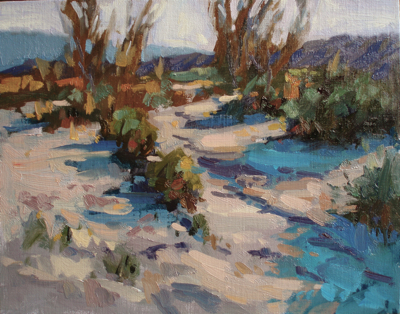
Another desert painting! I can see another trip down there in the near future, perhaps end of this month, when I have my next week off for painting. I think the design for this one looks a little too linear. Not sure, what do you think?
Coachella Valley 2

The design seems fine to me, I like it.
It is my impression, though, that the eye is drawn to the orange spot in the upper left corner (a bit too high for a “sweet spot”, I am not sure what it is, but it is slightly more saturated than the rest), and is in danger of leaving the painting from there. I am not sure, but I would have tried a tiny bit of similar orange somewhere within the blue in the bottom right corner — it would add tension and keep the eye in the painting. But on the other hand, I know I have a tendency to tighten up the color composition too much, so I may be absolutely and completely wrong.
@Lena, yes, I see your point. I think you’re right. The eye moves right out of the picture; I needed to add a force leading back in. The painting feels “one-directional”, if that makes sense. I’m lead from lower right hand corner to the top left and out. The distant hill was meant to bring you back into the painting, but the tree breaks that line, and so stops you. I bet if I were to remove that tree and strengthen the slope of that distant hill, it may better work.
Ed and Lena,
I actually like the fact that the design leads my eye up the hill and makes me want to see what is on the other side of the hill into the valley. I think too many paintings follow the rules. Artist should be creative and bend the rules… especially design.
Nice job Ed and I’m sorry Lena for being the “Siskel or Ebert”… 🙂
Tom
@TomC: No apology necessary, all feedback welcome!
I’m with Tom, bend or break the rules if you can make it work. This one works for me.